
Fujifilm Film Simulation Comparisons: More Than A Gimmick
Disclosure: This post may contain affiliate links. I earn a small commission of product sales to keep this website going.
Updated to include REALA ACE.
What are Fujifilm Film Simulations and why are they so "trendy"? It's not just trendy - they have a lot of practical photographic utility. The first step is to actually understand the film simulation comparisons, what they do, and when to use them.
Back in the days of film, you would pick a film stock based on its character, how well it captured the feel of what you were photographing and your style. This was the baseline, then you could tweak it in the darkroom.
In today's digital age, most photographers shoot a flat RAW file and then sit in front of their computers. Some for hours. Many have styles & presets for faster processing, with each photo individually tweaked after that. But none of this happens until after the photo is captured.
Why can't we just do the styling part in the camera when capturing the photo? That's what Fujifilm's film simulations are for.
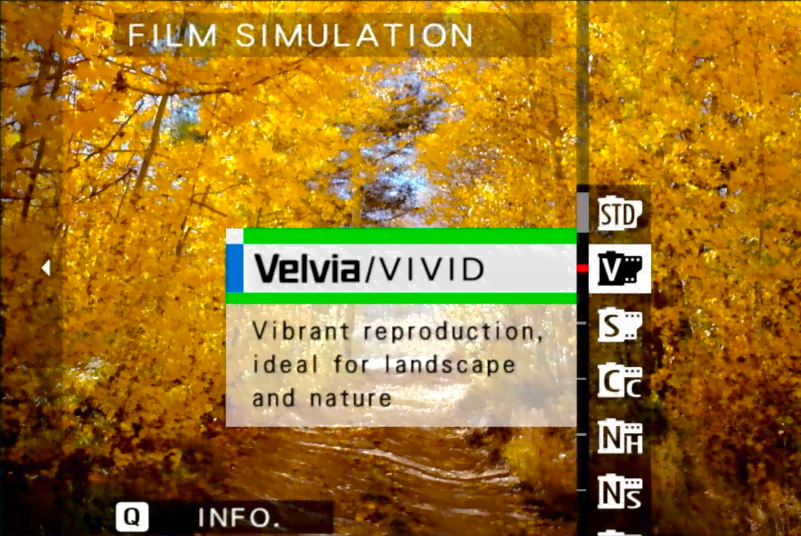
Do you treat your landscapes with bold colors and contrast? Choose Velvia, as I did decades ago when photographing the Arizona landscape.
Do you have RAW styles/presets that produce muted colors and flat contrast? Eterna will suit you well, or perhaps Pro Neg Std.
Each of these Fuji film simulations can be further customized to your tastes by making presets that give you far more creative control than other camera manufacturers.
Are these film simulations identical to the real deal? No. But they look and react very similarly. These will always be digital files with digital drawbacks, but Fujifilm continues improving on them.
Not sure which film simulation to pick? Read this post to learn about Film Simulation Bracketing mode.
Fujifilm Film Simulation specifics
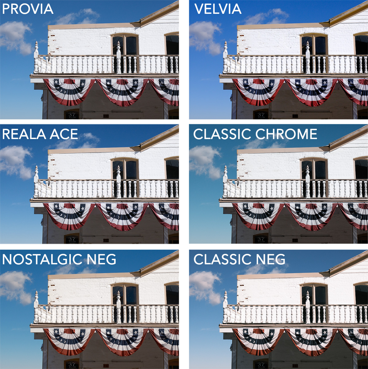
I've provided comparisons for the color film simulations to PROVIA, which is considered the most neutral. When you look at the comparisons, pay attention to the differences in contrast and how colors are rendered.
Please note that not all Fuji Film Simulations are found in all cameras. Fujifilm has been adding new ones with each generation. You'll have to go to your Image Quality Setting menu to see which film simulations your camera has.
PROVIA (STANDARD)
Medium Contrast, Medium Saturation
Characteristics: True colors with no intended color casts. There is some contrast, but it isn’t noticeably strong. It does a good job of not intentionally clipping shadows or highlights without making them too soft.

Common Uses: This Fuji Film Simulation can really be used for anything. That’s why you’ll find it called “Standard” in the camera menus. If you’re panicking about which film simulation to use, you can’t go wrong with PROVIA. And if you’re one of those folks who does minimal post-processing with their photos - no wild contrast, color grading, or saturation shifts - this is the perfect film simulation.
ASTIA (SOFT)
Medium Contrast, Medium Saturation
Characteristics: Astia is called “Soft” in the Fujifilm menus, but that's kind of a misnomer. The softness mostly only occurs in the skin tones where they're desaturated, hues are shifted away from red, and highlights are tempered. The image keeps its punch without making everyone's skin look like it has jaundice or rosacea. If you like blues...blues, on the other hand, are almost neon. I love the way Astia handles blues.
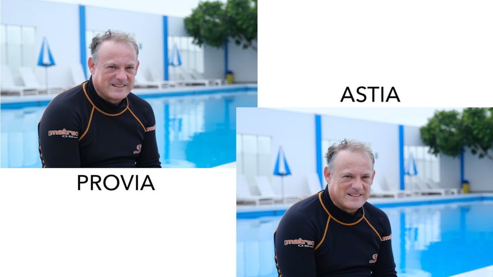
Common Uses: This is a typical film stock & simulation for portraits thanks to its rendering of neutral skin tones. It also works well as a general travel film look. If the Pro Neg films don't have enough saturation for you, try this.
VELVIA (VIVID)
High Contrast, High Saturation
Characteristics: This beloved Fujifilm film simulation will likely clip your shadows and highlights simultaneously, especially in high-contrast scenes. The saturation is also high, especially in the purples, blues, oranges, and greens - landscape & sky colors. Be careful; it will amplify any color casts, especially in the blues and greens. Blues are slightly shifted towards magenta to produce colorful skies. VELVIA has an extreme highlight curve. Skies look better slightly underexposed.
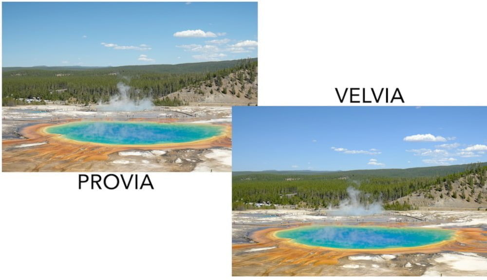
Common Uses: This is most commonly used for landscapes and nature photography. The vibrance in the greens, blues, and purples, along with the contrast, brings the scenery to life and gives it depth. I've always preferred this film simulation slightly underexposed.
CLASSIC CHROME
Medium-High Contrast, Low Saturation
Characteristics: CLASSIC CHROME wasn’t designed to emulate a specific Fuji film stock but rather a certain look. Color casts are mostly neutralized, desaturating purples and greens, though there is a hue shift towards cyan. Blues stand out against an otherwise gray world, with a little punch in the reds too. The look offers medium contrast for depth despite subtle coloring.
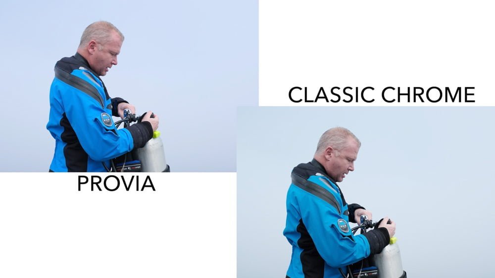
Common Uses: This look was popular in photojournalism back in the day and is a favorite for documentary & street photographers today. It is also used by landscape photographers who want some muted, neutral colors to subdue the scene.
REALA ACE
Medium Contrast, Medium Saturation
Characteristics: REALA ACE may initially appear similar to PROVIA, but there are some big differences. For one, the saturation is ever so slightly less than PROVIA. But it's not just the saturation that's different; there also appear to be luminance differences in some colors like blues, greens, and reds. It's almost like a built-in Color Chrome Effect and Color Chrome FX Blue setting. This gives REALA ACE a feeling of depth or dimensionality. Highlights appear to have a slightly harder tone, but shadows have a softer tone. REALA ACE doesn't have any built-in color casts like some of the other film simulations do; it's very neutral.
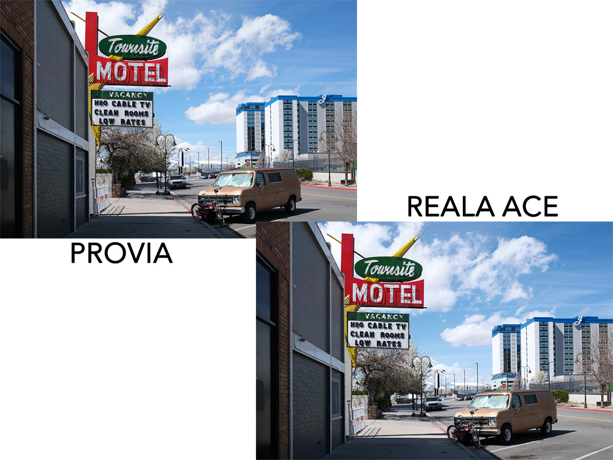
Common Uses: REALA ACE is a great alternative to PROVIA for general photography. Useful for portraits, landscapes, street, travel, and documentary photography.
PRO NEG STD
Low Contrast, Medium-Low Saturation
Characteristics: This film simulation is based on Fuji's Professional Color Negative film and comes in two flavors. Both are optimized for portraits. PRO NEG STD is much more subdued than ASTIA, the other film recommended for portraits. It has lower contrast, and the colors are less saturated also, especially in the skin tones.
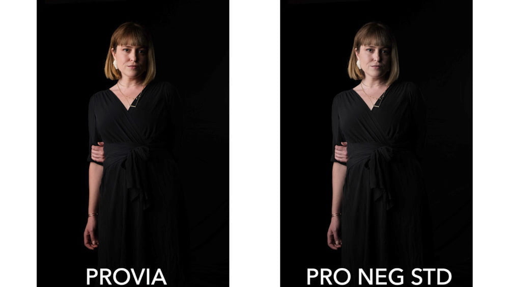
Common Uses: The soft, subdued look of PRO NEG STD makes it ideal for indoor portraits. It was intended for studio portraits where you can create your own shadows because it doesn't have a lot of contrast otherwise.
PRO NEG HI
Medium Contrast, Medium-Low Saturation
Characteristics: PRO NEG HI is the higher-contrast version of PRO NEG STD. The increase in contrast also deepens the colors slightly.
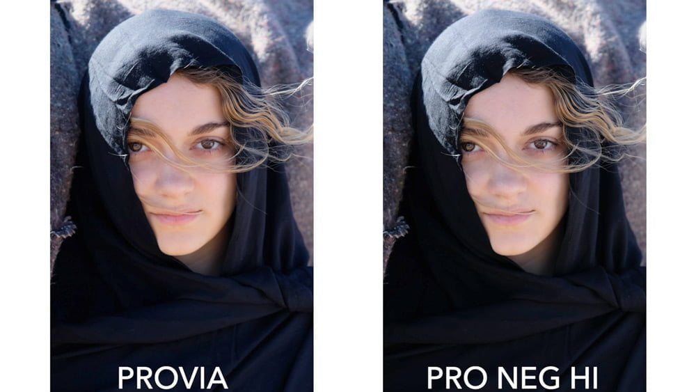
Common Uses: Like ASTIA, this film simulation works great for outdoor portraits. ASTIA, however, can be too saturated for some people, especially in the blues, yellows, and oranges. PRO NEG HI subdues these colors for a more natural look.
CLASSIC NEG
Medium-High Contrast, Medium-Low Saturation
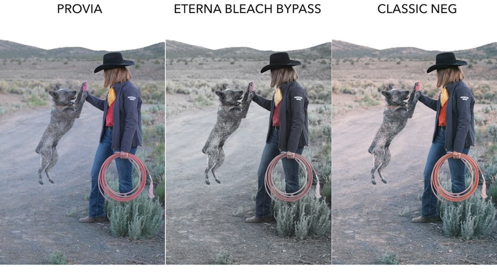
Characteristics: CLASSIC NEG is one of the newer Fujifilm film simulations. It's a bit like CLASSIC CHROME, but instead of a "cooler" shift towards cyan, it has a "warmer" shift towards red, particularly in the highlights. The shadows actually move towards a slightly cool tint. It's subtle but a good way to get that vintage look with warmer hues. This is loosely based on Fujicolor Superia films.
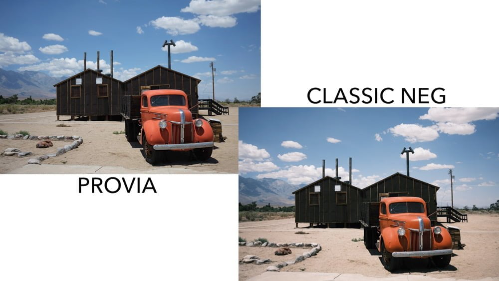
Common Uses: The CLASSIC NEG film simulation is great for documentary and photojournalism, like CLASSIC CHROME, but when you want "warmer." This film simulation will also work great for outdoor portraits, keeping deep shadows with natural skin colors.
I compare Classic Neg and Classic Chrome with some side-by-side photos here.
NOSTALGIC NEG
Medium-Low Contrast, Medium-High Saturation
Characteristics: NOSTALGIC NEG, like CLASSIC CHROME, isn't based on any particular film stock but rather a look, specifically the New American Color look popularized in the 1970s. NOSTALGIC NEG compared to CLASSIC NEG may look similar at first glance thanks to their warmer tones, but NOSTALGIC NEG is actually more saturated and has softer contrast, particularly in the shadows. Shadow areas really retain their color & texture.
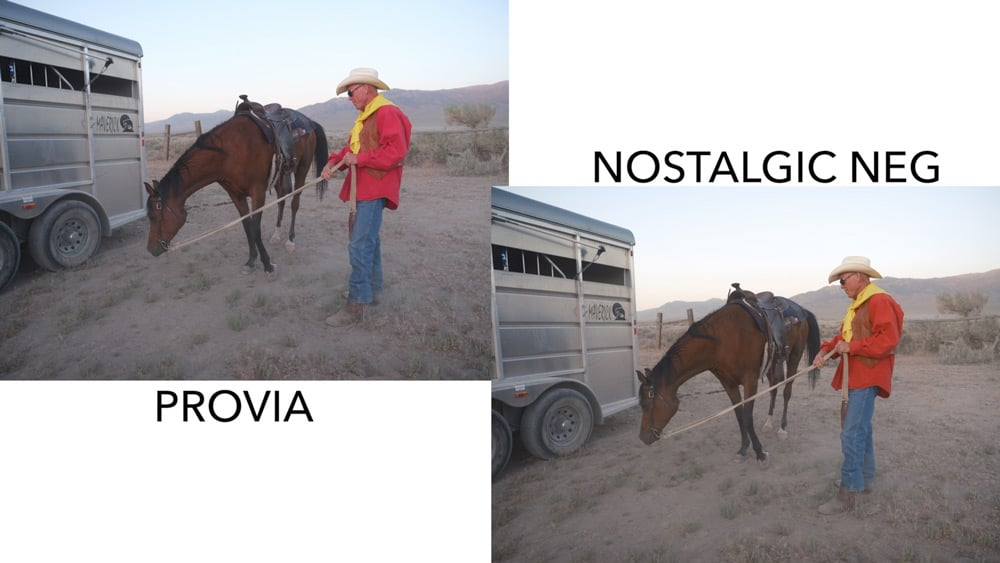
Common Uses: NOSTALGIC NEG is excellent for documentary photography, portraits, or really any outdoor photo on a sunny day. Any time you want your photos to have a more nostalgic look!
You may also want to read: Classic Neg vs. Nostalgic Neg
ETERNA (CINEMA)
Low Contrast, Low Saturation
Characteristics: Eterna was developed for cinema. It is a very soft film simulation with low contrast. Colors exhibit low saturation and smooth tonal gradations, with a slight blue shift towards cyan.
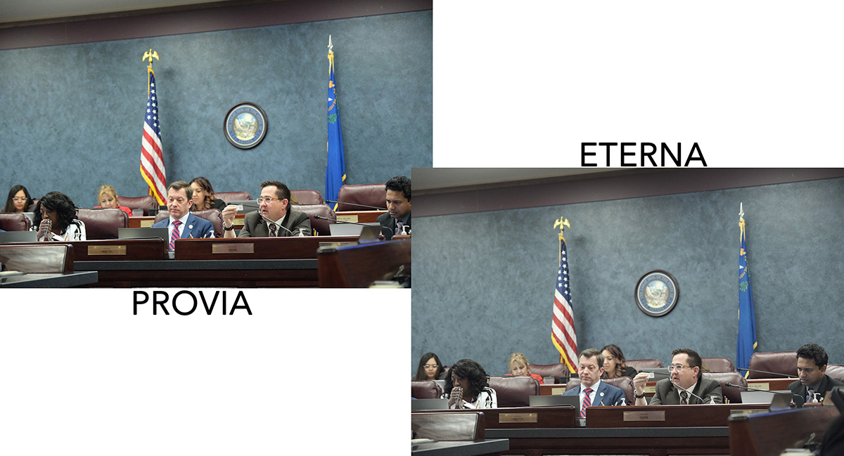
Common Uses: This is a favorite Fuji film simulation for cinematographers though the style also suits many still photographers as well. It's a great simulation to use when the photo is all about "story" rather than the tones and colors since those will be mostly kicked to the curb.
ETERNA BLEACH BYPASS
High Contrast, Extra-Low Saturation
Characteristics: Eterna Bleach Bypass is a different cinema option than Eterna. The saturation is ultra-low, almost to the point where you might think it's black & white at first.
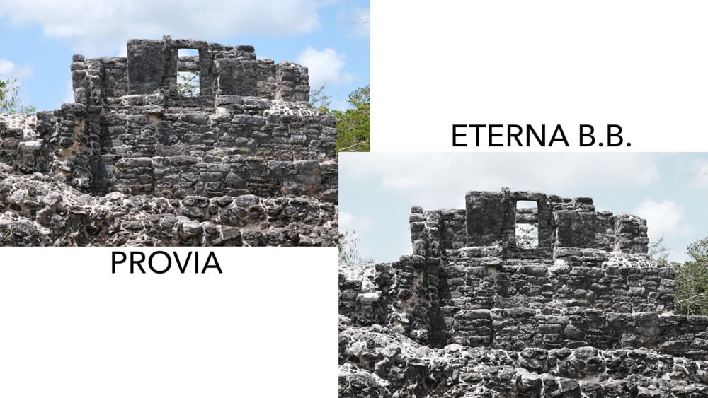
Common Uses: When you still want your images to be about the story but need the contrast that Eterna doesn't offer, Eterna Bleach Bypass is a good option.
ACROS
Medium Contrast
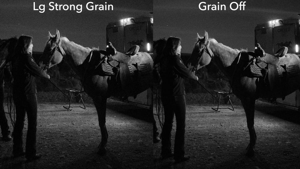
Characteristics: ACROS is completely different from "monochrome." It's based on Fujifilm's Acros Neopan black & white film, and the digital rendering is very popular with photographers. You'll get a lot of texture in the highlights and retain details in the shadows. It does have a higher contrast than film. ACROS also has its own noise reduction algorithm to handle grain - it adds beautiful digital grain you'll need to try. I dare say the ACROS in-camera grain is better than anything you could add in a post-processor.
You have standard ACROS and three filter options - Green, Red, and Yellow - common in B&W photography and used for different purposes. I've dedicated an entire article to the ACROS color filters, what they do, and when to use them, and you can read that here: Using ACROS Color Filters.
Extra Fujifilm film simulation comparisons
Here are some additional comparisons of Fujifilm Film Simulations.
Other than some cropping to save screen room, these are how the JPGs came out of the camera; no other adjustments were made to toning or colors.
You can sign up for my free Fujifilm film simulation course to see additional comparisons and learn about the film simulations more in-depth.
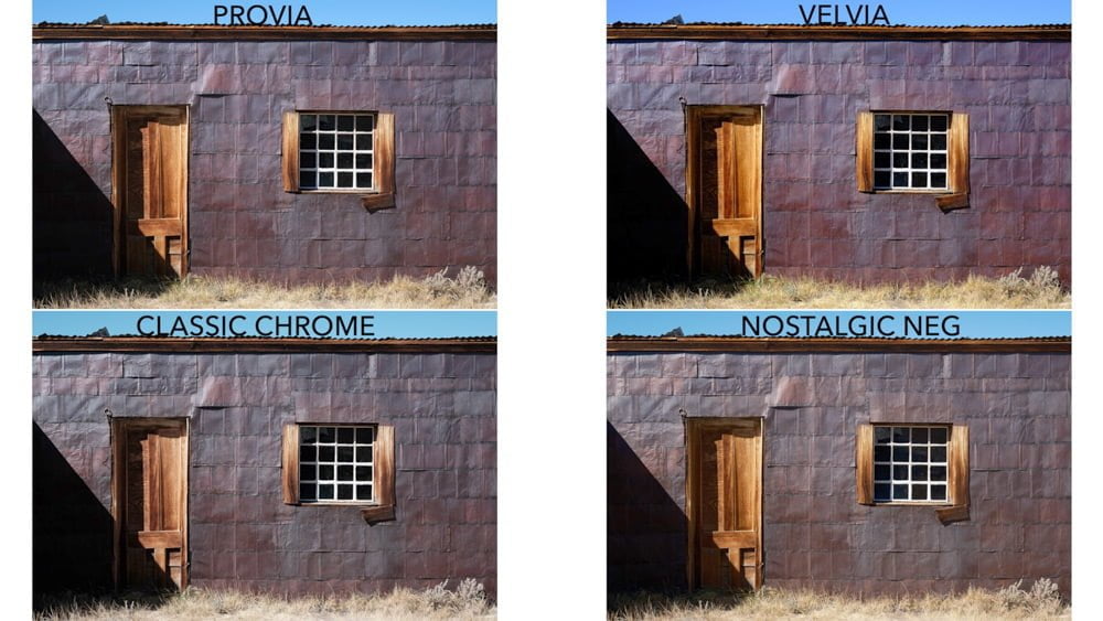
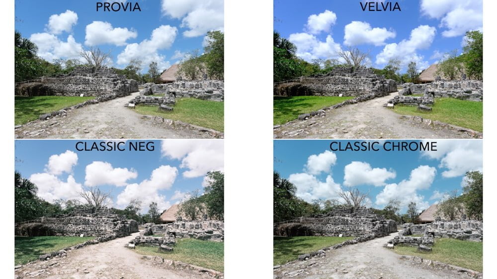
If you're looking for ACROS and ACROS color filters, I created an entire article dedicated to these comparisons: ACROS Color Filters.
For more Fujifilm film simulation comparisons, a PDF download, a film simulation quiz, and in-depth videos, check out my free Fujifilm Film Simulation Course. Yes, it's free and not even spammy like other free stuff!
Nice article with illustrations. Very little difference between Astia, Provia. Very little difference between Classic Chrome, Pro Neg Hi and Pro Neg Std. Even Eterna is not that far from this group. Velvia is different but closely related to Astia and Provia. Fuji has about three different colour looks + the special BW Acros. The rest is just marketing.
Thanks for the feedback Alec! I could have continued with endless comparisons, but that'd just be excessive. If I had, it'd highlight even more differences between all of the simulations. The differences really don't matter to people who shoot RAW - most photographers - and that's cool.
But I know a number of professionals who only shoot JPEG, and to them, the differences that are "subtle to nonexistent" to most people are actually huge to them, depending on color schemes, exposure, lighting, etc. It just takes a lot of shooting to see that, for example, the differences between CC, PNH, and PNS can be significant.
A handful of web-friendly comparisons just can't do them justice.
I’m currently using an old X Pro 1 but really like the classic chrome look. If your opinion which sim comes closest on the X pro 1? Pro Neg hi or STD?
Hi Scott, try Pro Neg Hi with a Color correction of -2. Some of the colors will be rendered slightly differently with a touch more saturation, but it'll be close.
Hi John thanks for this. I’ll give this a go. Should shadows / highlights be left at 0?
Yes that's right, but you may want to try +1 to either or both of those just to see how you like it.
Very thorough article, thanks. I've been shooting Fuji for about 4 years, and appreciate the film simulations. There are times I only shoot RAW. I only recently read that the film simulations also affect the RAW files regarding contrasts, highlights, etc. I'd like to see you discuss that aspect of simulations.
Hi Michael, thanks. Where did you read that? They won’t affect how the RAW file is recorded by the camera, but they do affect how your RAW converter renders them. Some RAW converters do this automatically without really telling you what’s going on, which leads people to believe that tones are affected during capture of the RAW. But it’s really in your software.
So, just to confirm.. If I shoot Raw + Jpeg it will add the film simulation on the jpeg image, but then I still have the Raw as an untouched backup?
True statement. If you're using Capture One, that will automatically apply the Film Simulation profile when you open the file, but you can revert it to a base RAW file without a profile.
Hi John, very informative article. I love the Acros look but can't justify upgrading from my XT1 just for one film simulation. Any suggestions on the XT1 camera settings to emulate the look of Acros? Thank you in advance.
Hello Peter, from what I understand, it took the engineers years to come up with a digital simulation that even slightly resembled the film stock. It’s going to behave completely differently to light and colors than any monochrome setting. With the rising popularity of the X-T3 & 30 though, you might be able to find a good used X-T2 or 20 for a very reasonable price.
Superb work... so helpful. I'm a RAW shooter (with JPEGs for reference "proofs"), and it is still important to see those differences. I had ignored Classic Chrome initially (until Capture One included the sims) based on my film days assumptions about slide films. For sure, it doesn't emulate any slide film (no matter the brand) - but I find it superb and possibly more natural overall than the two Pro Neg simulations in the majority of situations.
Thanks James, glad you've been enjoying it.
And that's another thing - it really helps to understand which film simulations you want to use when shooting, even if you only care about RAW, to give you an idea of that file's potential based on the style you want.
Def not a gimmick. Been using Fuji (X-E1) since February 2012. LOooooooVE the film simulations. I now have the X-T1, 2, and the X-H1. Soon, one of the XPro3's... I also shot Fuji film back in my medium format film days of the eighties. Good article. Thank you.
Thanks for the feedback Jorge. Yeah, I'm looking forward to seeing the new simulation that comes out in the X-Pro3. It looks like a good cross between CC & Provia as far as I can tell.
Schöner Artikel
Danke!
Excellent article! I used this to explain/justify my fujifilm camera purchase to my significant other
Haha yes, sometimes we have to justify things like this, I'm glad it could help!
Thanks for the article and examples.
I used Fujifilm cameras for years without understanding or caring about film simulations. Nowadays I highly appreciate them. I always shoot jpg+raw, keep the raw files as I would keep the negatives in the old days but almost never use them. The ability to create different jpgs in-camera from raw files is priceless and usually produces images that I simply can't get any better from raw files on a computer. Not that I don't do post-processing on my pc but the jpgs are so good I usually rely on them only.
Film simulations are also a great way to learn what all those settings will do for you - with a lot of practice!
You're very welcome.
Yes, the reason why people love these film simulations goes pretty deep into the heart of why they love photography. These cameras make it fun to be creative, once you start using these simulations and understand when & where they're appropriate for your style.
Hi John
Can you help me with the correct simulation for making my wedding and lifestyle photography look more like film please? I currently use CC but recently have just started noticing that it's a bit too contrasty for my taste. I like warm tones also of that helps but not the whole orange Donald Trump look that people are using recently for weddings ????
Hi Gary, which camera are you currently using? If you have a camera with ETERNA, I've recently been toying with that for still photography, even though it's a "movie" simulation. I increase the color and the highlight & shadow tones and it actually works well for that look, depending on the subject. Something worth playing around with if you have it.
For CC, you can reduce the Shadow Tone to -1 and use DR AUTO to reduce the contrast a bit. Then you can set a White Balance Shift in the direction of yellows and reds to warm it up a little, since it is a cool simulation already.
You can also make some drastic changes to PNS or PNH for some different looks which might work for your wedding photography. Take it all for a spin in X RAW Converter using photos you already made with that camera to experiment with what changing Highlights, Shadows, and Color does to it all to get a style you like.
Hi John, great article! I haven't seen a better overview of Fuji film simulations! I think Fuji would do well to provide a fact sheet or small booklet to help us understand how and when to apply them.
They do have some information on their website, but it's rather spread out and unorganized, and a little more technical in nature. I hope this is a more concise resource for most people 🙂
Hi John - thanks for the excellent article - really well put together. I have an old X-Pro1 and, although the options are more limited than on the newer cameras, I love experimenting with the film simulations. Messing around with the white balance can produce some really interesting effects too
You're welcome! Glad to hear those first-generation models are still out there and making people happy.
I have been thinking about what happens after the images are imported to my Mac. The colors are muted and there is a film look. That's my reason for using the film simulations. I did a white balance in Lightroom and photoshop and I did not like the results. The digital look came back. Editing is subjective and each photographer has an idea what a photo will look like. I have edited images to stir the creative juices within, but then I stop and say hey you wanted a film look. John what are your thoughts about editing?
Other than being completely subjective like you say? I personally try to process as little as I can. I like to think that most of the "processing" happens prior to pressing the shutter button. I want to be out doing things, not playing with sliders on the computer 🙂
I like the fact that I don't have to do much editing and the pictures comes our stylized as if they've been edited in Lightroom - not via some cheap third party filter.
Pro Neg Hi is my favorite. Classic Chrome is a close second.
Amen to that! Yes I find myself using PNH more and more.
Thanks for your really helpful discussion and illustration of the different simulations. It gets to very fine gradations between some of these that I imagine would be very different again depending on lighting, colours and the subject.
This is a very well written article and explains the simulations and value of they bring perfectly. I do shoot RAW+JPG just in case I need to something more in depth but typically I don't need to.
If you have an early camera such as an X-Pro1, and you change the exif data on the raw file to say XT3, then with Capture One you can choose any simulation available on the newer XT3.
Thank you for the feedback!
Yes, I'm always recording RAW+JPG, especially for commissioned work, but I rarely ever process the RAW files for personal work.
How do you know what film simulation is used when looking at the photos on a computer. I can't find any information telling me what I shot. Do I need to look at it on my camera and write down what I used just so that I know when I look at it later at my computer? Should I just shoot in RAW and add simulation in Capture One? As a Fuji X owner I'm very confused why everyone plus Fuji is raving about these film simulations but once I have them on my computer I have know idea which one I used! Any help would me much appreciated.
Thank you!
You can use Fujifilm's X RAW Studio software to check the Film Simulation on the computer.
This isn't an EXIF field found on any other cameras, so programs like Lightroom and Capture One don't have a display option for it. However, Capture One will read it and apply it to the image if the Base Characteristics "Curve" is set to Auto. It just won't say what it is. If you're going to be processing RAW files in Capture One, then you might as well just apply a film simulation in that Curve menu, so you know which one you're using.
If you have a few favorite film simulations that you always use, you'll know which is which just by looking at the images after a while.
Outstanding information! Thank you!
Hi John, excellent article on film simulations. I recently started shooting with a Fujifilm GFX 100s. Today I shot a group of portraits of my wife wearing a teal turtleneck. In camera and in Adobe RAW the turtleneck looked blue rather than teal. I was shooting indoors using three Elinchrom strobes. There was some ambient light. After changing my white balance from auto to flash in RAW it looked about 50 percent closer to the actual color. I was using the default film simulation, which I believe is Provia. What do you suggest I do to get the correct teal color rather than blue?
Yes, Provia is the default. When doing strobe work, I prefer to set a custom white balance using a white balance card first. It's a controlled environment, and even though strobes may have slight temperature variances from one pop to the next, it's usually a closer option than Auto or Flash. Or at least get a photo of the WB card in the studio so you can adjust it in post. If you already did that, apologies 🙂
To get the teal back, you could just go to the Selective Color tool in ACR and change the hue of the blues.
But regarding the film simulations, if you're using ACR, the film simulation selected in the camera when you created the photo won't be applied to the RAW file you see in ACR. It's just the RAW file. You can select a film simulation profile in ACR but those are Adobe's "best guess" at the film simulations, not the actual film simulation, so there will be color variances.
@John Peltier,
Thanks for your response. Yes, I found that a custom white balance of around 5500 works best rather than flash, which is 4850. I’ll try the Selective Color tool. It strikes me as odd, though, that with all the finagling the color never quite matches reality. Do you know why that is?
Well, there's a lot more to it than "matching reality." We all see colors differently, monitors need to be calibrated, color balance is tricky...and then Provia, as "natural" as it's supposed to be, simulates the PROVIA film, and film doesn't reproduce color 100% accurately. If just one color is noticeably off and bothersome, selective color seems to work best for small adjustments.
This is a fantastic article, thank you so much! I don't think I've ever seen the film simulations analyzed and explained in such easy-to-understand detail. I have to admit: I am one of those RAW-only Fuji photographers who is now beginning to see the light that jpg is just fine most of the time (sometimes with minor edits). Shooting RAW+JPG is a great compromise. Looking forward to taking the course. Thanks again!
You’re welcome, have fun with it!
Thank you for a great article, John!
This is the film simulation comparison I hope existed, but have never been able to find. I've been a fujifilm user since 2013, but have never really made much use of the film simulations. Your article was a huge help in getting to grips with the differences and advantages of each. Now I really look forward to testing them out properly.
Well, I'm glad you found it, and I'm glad it helped! I hope you have fun using these in future.
Is there any way to modify a film simulation recipe in-camera to enhance to boost a specific hue, such as greens or reds? I know that you can do that in-camera for Acros or Monochrome, but is there any way to do that for other simulations in-camera?
Some cameras have a "color chrome effect" setting that can affect the luminance of certain colors (it varies by camera) but that's all you can do for targeting specific colors in the camera.