Disclosure: This post may contain affiliate links. I earn a small commission of product sales to keep this website going.
Newer Fujifilm X cameras are equipped with a few more great settings to further customize your in-camera JPEGs. In addition to the Clarity setting, Color Chrome Effect and Color Chrome FX Blue get us one step closer to finding that unicorn of creating styled, striking photos in our camera, without ever going into a processing program.
But what are Color Chrome Effect and Color Chrome FX Blue?
What do Color Chrome settings do?
To sum up the camera manuals, all they say is that they increase the range of tones in colors that tend to be highly saturated, like reds, yellows, greens, and blues.
Okay, what? Yeah, that got me too at first.
Let’s look at it this way. When a color is already very saturated – very rich – all of the different shades of that color have a tendency to disappear. Instead of seeing that sky blue in subtle gradations of blue, you may just see one shade of that blue across that entire sky.
The Color Chrome settings try to fix that by decreasing the luminance of those colors – i.e. making those colors darker in an attempt to bring those gradations back.
If you’re a Lightroom user you can play around with this for yourself. Find a photo with some saturated colors. On the HSL panel, pull down the luminance of that color.
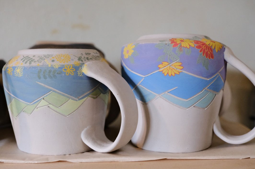
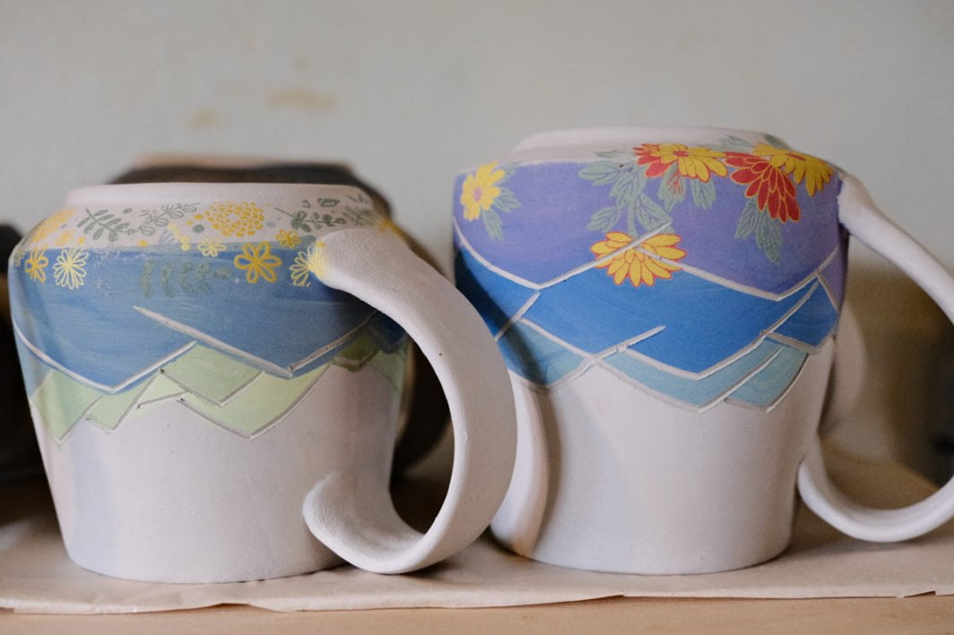
In the photo below, note how the textures in the blue paint stand out more with Color Chrome FX Blue applied. Processed with CLASSIC CHROME, the first image does not have any Color Chrome settings applied, while the image on the right has Color Chrome Effect and Color Chrome FX Blue set to STRONG.
This has the effect of making that color appear to be more saturated and richer without actually increasing the saturation. The goal is to get those richer colors without the “fake” look of increasing the saturation too much.
What are the differences between Color Chrome Effect and Color Chrome FX Blue?
Color Chrome Effect affects yellows, greens, reds, and oranges. Below, Color Chrome Effect OFF (left), STRONG (right). PROVIA film simulation.
Color Chrome FX Blue only affects blues. Below, Color Chrome FX Blue OFF (left), STRONG (right). PROVIA film simulation.
If you’re using Color Chrome Effect in a photo with just a lot of different shades of blue, you won’t see any changes in the photo, because that setting doesn’t affect blues.
Conversely, if you’re only using Color Chrome FX Blue in a photo with a lot of other different colors but no blues, you won’t see any changes.
How do you use Color Chrome Effect?
There are three settings for Color Chrome Effect and Color Chrome FX Blue.
- OFF (no changes applied)
- WEAK (slight amount of correction)
- STRONG (a lot of correction)
And there are also a lot of variables that influence the effects of these settings. Unfortunately we can’t just say, “set it to X and this will happen, set it to Y and this will happen.” Be aware that all of these things affect what this setting does:
- Exposure
- Initial saturation of color
- Film Simulation
- White Balance
- Tone settings
- Color setting
Effects of Film Simulation Used
Your choice of Film Simulation is going to influence how WEAK and STRONG affect the colors.
For example, ASTIA, VELVIA, CLASSIC CHROME, and CLASSIC NEG all render blues differently. Actually, all film simulations render blues differently.
Here are some before/after images of the same photo re-processed in-camera with VELVIA and CLASSIC NEG, and Color Chrome FX Blue OFF and STRONG for each one. The two film simulations render blues very differently, and so the Color Chrome FX Blue setting makes the comparisons look different.
Here’s VELVIA with Color Chrome FX Blue OFF on the left, and Color Chrome FX Blue STRONG on the right.
Below, CLASSIC NEG with Color Chrome FX Blue OFF on the left, and Color Chrome FX Blue STRONG on the right. CLASSIC NEG doesn’t render saturated blues to begin with, so the change is much more subtle than VELVIA.
Now here’s another image processed first in ASTIA, which has rich colors (though not as saturated as VELVIA), with both settings OFF and then both settings STRONG.
The same image with ETERNA BLEACH BYPASS below, processed similarly (Off then Strong), will have a much more subtle difference due to the desaturated nature of ETERNA BLEACH BYPASS.
Do Color Chrome Settings Affect ACROS?
Photographing in just black & white, like ACROS or Monochrome?
Using Color Chrome Effect and Color Chrome FX Blue will not alter your photo, even though the settings are available to change in monochromatic film simulations. Use Color Filters instead.
Advantages and Disadvantages of Color Chrome Effect
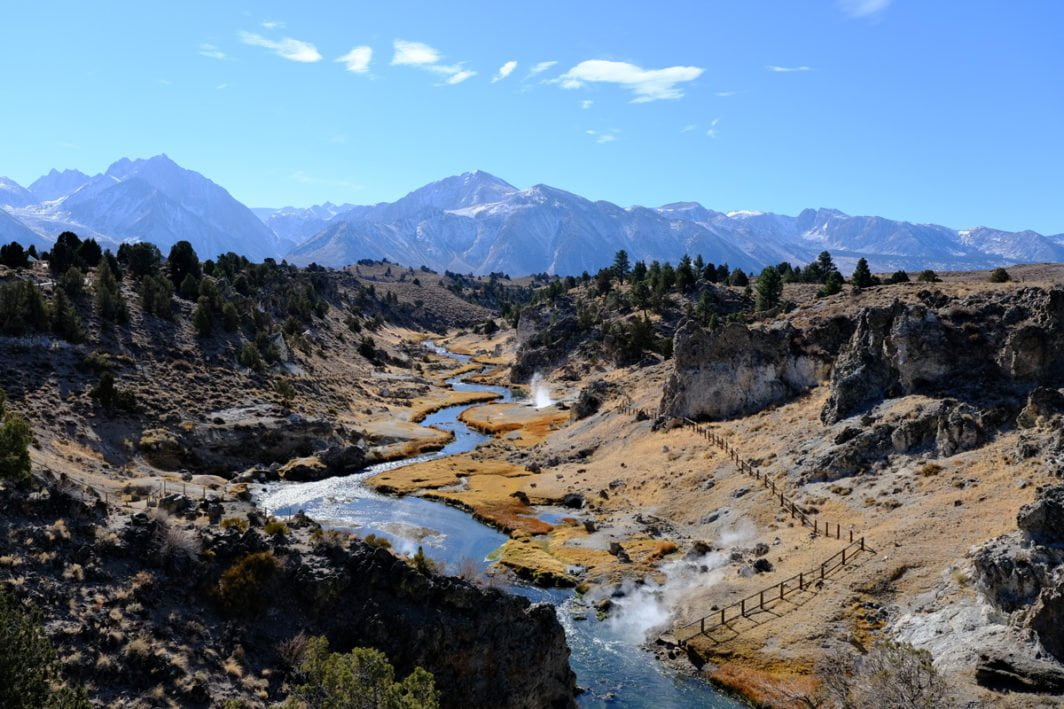
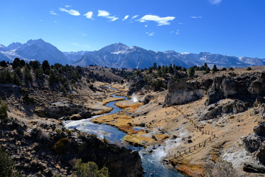
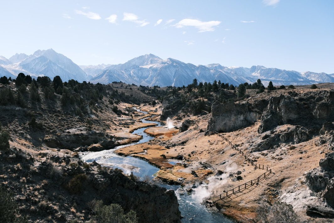
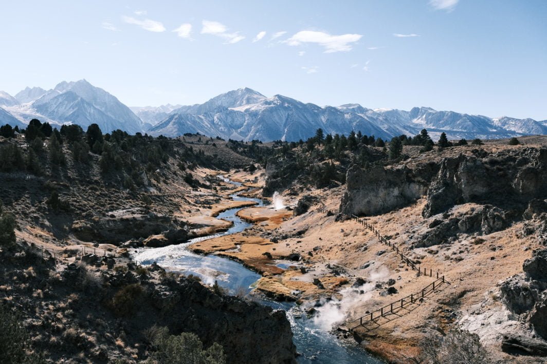
We can see one advantage to these settings that I love in the above landscape photo with the creek. Color Chrome FX Blue gives the sky much more contrast with the clouds, as you might get by having a polarizing filter over the lens. The creek also has richer colors. This works well for landscapes.
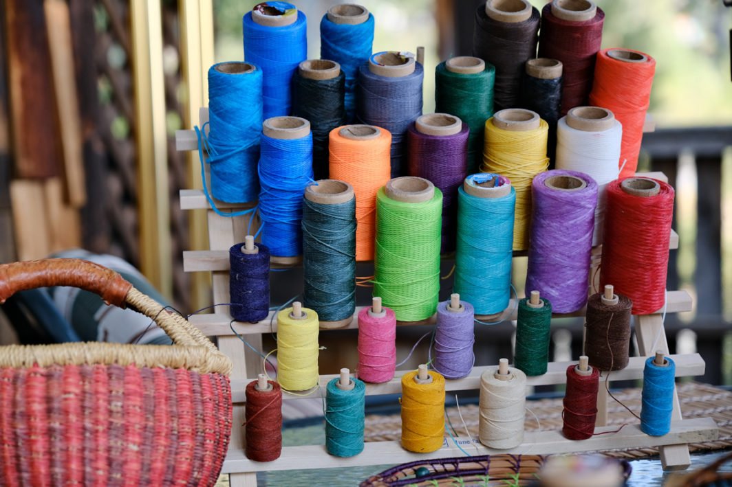
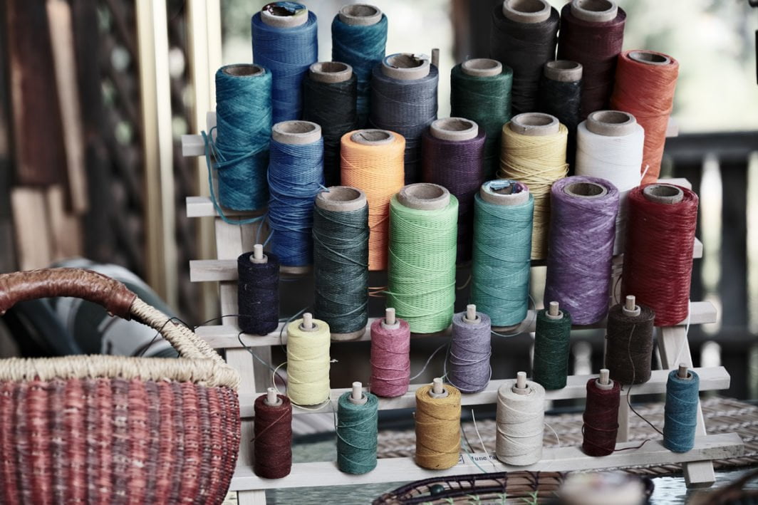
But at the same time, in the next image of the threads, Color Chrome FX Blue set to strong makes the blue threads too dark, to where their brilliance is reduced. A setting of weak does work better for that photo.
Below, Color Chrome settings OFF are first and WEAK second.
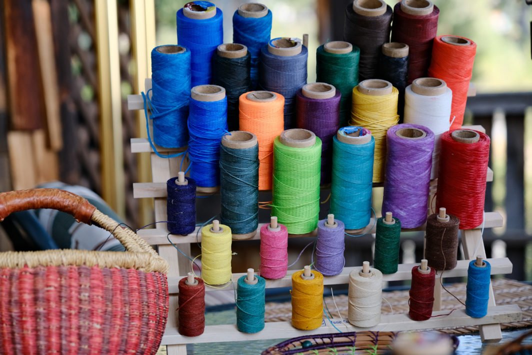
It seems that the modifications are made uniformly regardless of the initial luminosity & saturation of the color. So if a blue in your photo is already dark, Color Chrome FX Blue is just going to make it even darker.
This means you don’t have as much control over these modifications as you might if you did this in something like Photoshop or Capture One. But hey, for something we can do in-camera to make our JPG photos come to life even more…I’ll take it!
Using these in your Custom Settings
Because they’re predictably unpredictable (or unpredictably predictable?), I’ve found I much prefer using WEAK if using them at all in my Custom Settings. It’s actually not that these behave unpredictably, but that I can’t always predict the initial saturation and luminance of what’s in front of my lens. And sometimes, STRONG may be too much.
If you want to learn how these settings might fit into custom settings you want to create, one of my newest courses will take you through it.
TC
Saturday 1st of October 2022
Hello, I see color chrome effect but no menu for Chrom fx blue. I'm on the xt 30, am I missing an update>
John Peltier
Sunday 2nd of October 2022
Sorry, but Color Chrome Blue is not available in the X-T30...but it is in the X-T30II.
Brandon
Tuesday 15th of March 2022
When I pull down the luminance of blue on an HSL panel the result is that the color appears less saturated with decreased luminance, not more. Also it doesn't seem like this effect can really be mimicked with HSL sliders.
I opened up both images as Layers in Affinity Photo, then sampled the same pixel in both images. For the regular image, the HSL value I sampled is 209, 66, 61. For the color chrome image, 213, 45, 51. That's about a 16% difference in luminosity, since 1 - (51/61) = 16.39. After a -16% luminosity adjustment to cyans and blues, the pixel was 209, 45, 55. Clearly Affinity Photo's HSL sliders aren't numerically precise. It did result in the correct saturation value at least. I didn't touch the saturation adjustment since S and L are not independent of one another in HSL so I expected adjusting luminance to affect saturation without adjusting saturation directly. Anyway, I adjusted until I matched the value of the pixel to the one in the color chrome.
What stood out to me is that the color chrome effect does not seem replicable using HSL sliders. The blues do not become nearly as dark overall, as the luminosity adjustment affects the hue uniformly. I tried playing around with some other methods (including global adjustments to the RGB luminance curve and masking that to blue hues) but I can't seem to crack how to accurately reproduce Fuji's color chrome blue effect! I might open up the normal image in rawtherapee to take advantage of the LCH curves in the LAB module later, but otherwise anyone have any suggestions?
(for the record, I dont have a fuji camera but I like this effect and would like to replicate it)
Rico
Sunday 4th of July 2021
Since I don’t have the patience or proper gear to post process, this article very helpful. Thank you!
John Peltier
Monday 5th of July 2021
Yeah it requires so much patience! I just want to press the shutter and be (almost) done with it!
Ray
Friday 15th of January 2021
Excellent write-up. Far better than any others I’ve read. Thanks
John Peltier
Friday 15th of January 2021
Trying to simplify things so my caveman brain can understand them :)
Earl Goodson
Saturday 26th of December 2020
Solid breakdown. Color Chrome is such an underrated feature and I like that you mentioned how it creates a similar effect to a polarizing filter, which is why I tend to use it frequently (CCBlue: Weak) when shooting skies in JPEG.
I hope Color Chrome finds its way to Capture One as the tonality boost seems more subtle than simply tweaking sliders. That or I need to up my post processing game...
John Peltier
Monday 28th of December 2020
Thanks Earl! Yeah it’s tricky to try to replicate this look by yourself in any kind of post-processing programs. But it certainly has a lot of potential in-camera, especially for getting great JPGs!