Disclosure: This post may contain affiliate links. I earn a small commission of product sales to keep this website going.
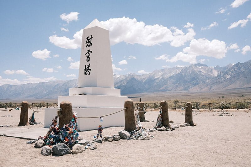
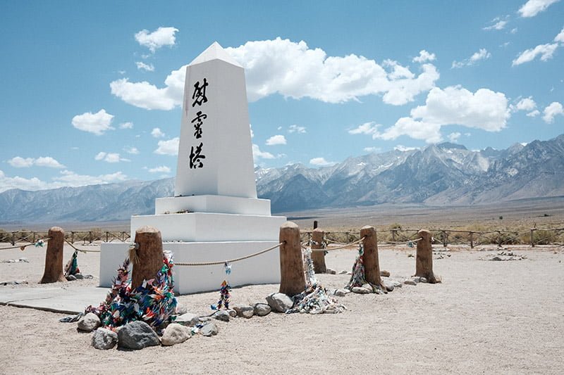
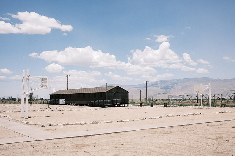
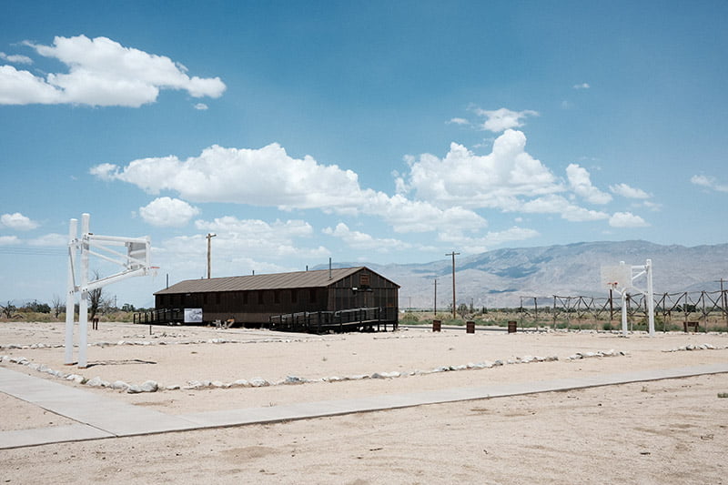
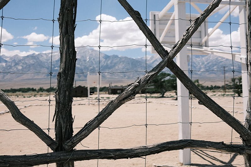
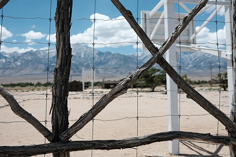
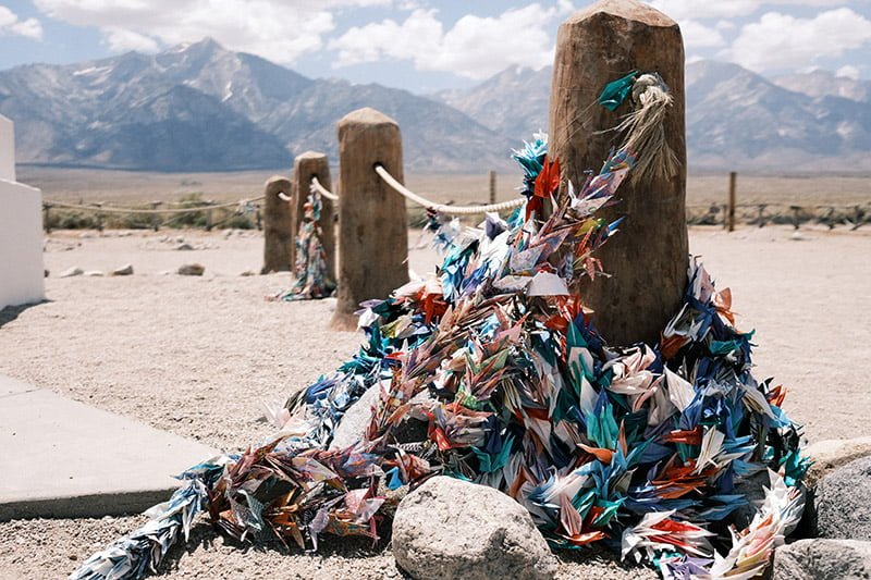
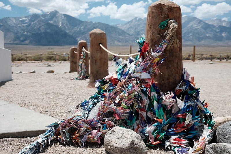
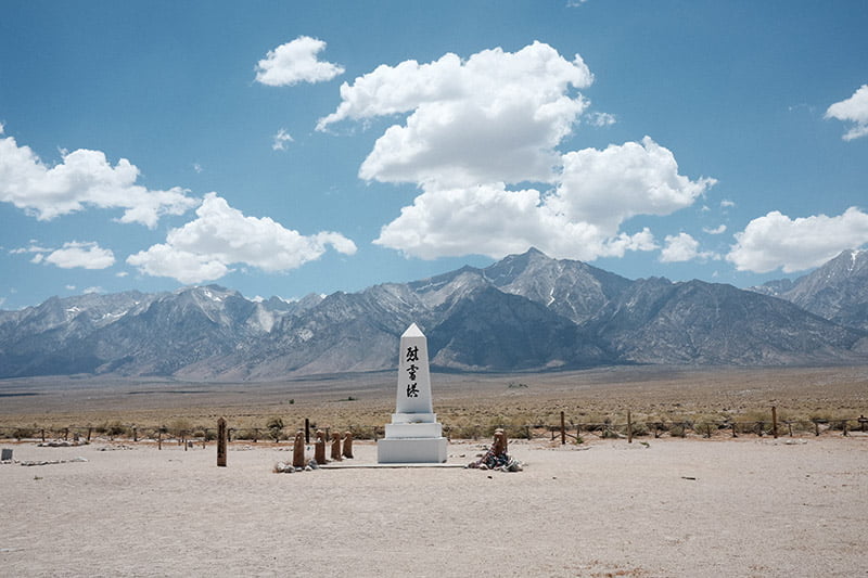
I stopped at Manzanar National Historic site for an hour on my recent drive down US395; it’s a stop that I make nearly every time I drive that stretch of highway. If you haven’t seen this haunting place, you owe it to yourself to check it out if you’re ever in the area.
I prefer to photograph this monument using the Classic Chrome film simulation. This time, however, I had my X100V with me and wanted to see how Classic Neg would be different. I don’t have a lot of experience with this film simulation yet and want to change that as I think it has a lot of potential – if you use it correctly.
Classic Chrome vs Classic Neg
If you’re not sure of the differences, you can read all about the film simulation differences in this post and even take a free film simulation course that I created.
I also wrote a dedicated article exploring the differences between Classic Chrome and Classic Neg here.
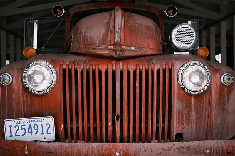
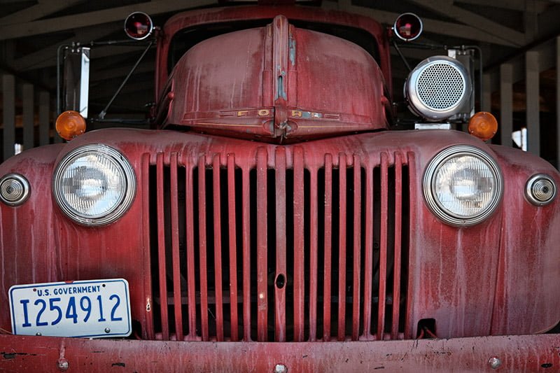
Classic Neg and Classic Chrome are both modeled after “vintage” (if you want to think of it that way) film stocks though neither of them has a real-life Fuji film counterpart. They both have subdued colors and strong contrast, making them a favorite for street and documentary-style photography. Classic Chrome is quite subdued with hints of cyan, while Classic Neg is a bit bolder with warmer hints of magenta.
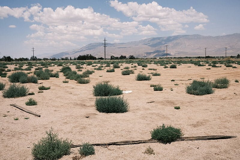
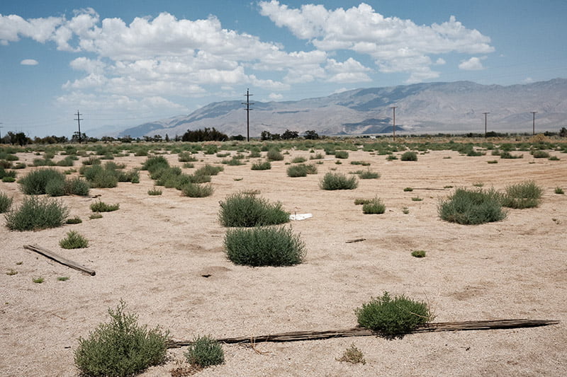
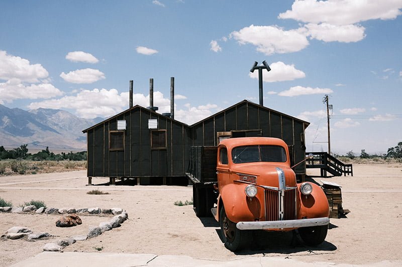
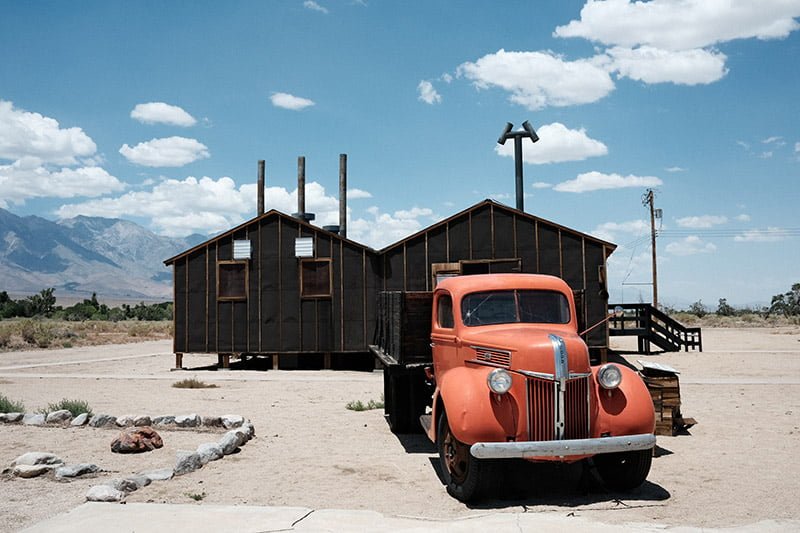
Would the warmer, harsher Classic Neg be better for photographing this arid, hot place than the cooler Classic Chrome? Would it better project that mood? I used a documentary Classic Neg preset that I just created. And to show you the differences between Classic Chrome, I also processed these photos in X RAW Studio using my Classic Chrome preset, which are here with the Classic Neg photos.
Which one does a better job of representing this…concentration camp? (I know they were officially called “internment camps” to avoid association with places like Auschwitz, but by every definition, they were concentration camps). There is no right answer and I don’t know if I’m sure yet. I’ll need some more time with Classic Neg. I’ll continue to refine this preset as I get some more shutter actuations with it. If you’re in the same rut, you can also try Film Simulation Bracketing.
Unfortunately, due to the pandemic, the buildings are currently locked up.
X100V Documentary Classic Chrome & Classic Neg presets
A note about these presets, these photos, and the X100V: I use different tone curves & color, so it’s not a strict comparison of the two film simulations. You’ll also see that the clouds are nearly blown out in some photos, even with DR AUTO set, which should have enabled DR200 in these scenes. Well, since it was a super-bright day in the desert, I lowered my ISO to 160 without giving it much thought. DR200 only works with a minimum ISO of 320. If you want to take advantage of this, don’t set your ISO below 320 and use the built-in ND filter if you need a large aperture, or use the Electronic Shutter. If you have no idea what I’m talking about, read this post to learn more about the Dynamic Range settings.
Classic Chrome
- DR: AUTO
- Grain: Weak Large
- Color Chrome: Off
- Color Chrome Blue: Weak
- WB: Auto, Shift 0
- Tone Curve: H +1, S 0
- Color: +2
- Sharpness: 0
- Noise Reduction: -2
- Clarity: +2
Classic Neg
- DR: AUTO
- Grain: Weak Large
- Color Chrome: Weak
- Color Chrome Blue: Off
- WB: Auto, Shift 0
- Tone Curve: H -1, S 0
- Color: -1
- Sharpness: 0
- Noise Reduction: -2
- Clarity: +2
The Classic Neg photos are the first in each pair, followed by Classic Chrome

Well? Which one does it for you? I’d love to hear your thoughts below, given the fact that photographers are their worst critics 🙂
antoine
Wednesday 27th of December 2023
I love the blues in classic neg along with the deeper contrast which makes some images look sharper. In some the images the mountains in the background have more contrast adding to the story of the scene in a mountain surrounded area
John Peltier
Thursday 28th of December 2023
Color can certainly do a lot for story - something I think is left out quite a bit. Thanks for sharing!
Rizvi Rahman
Thursday 13th of October 2022
The only difference I see is that the Neg has a slight magenta tint and a bit more contrast compared to the classic chrome.
John Peltier
Thursday 13th of October 2022
Oh it's so much more than that! The highlight and shadow tones are handled differently and colors all over the tonal map are shifted in different hue & saturation directions. It just takes a lot of going out and shooting to really see what the differences are.
Kib
Wednesday 12th of January 2022
Thank You very much for this. I learned a lot.
I'm brand new with 100V, and there's something about the way Fujifilm's tonality is.
Sometimes I miss Nikon's or Zeiss' strong colors, and I partly understand what Ken Rockwell thinks about the slightly muted colors from Fuji, where he says Nikon or Canon is better for everything, ...but people, , but at the same time there is something VERY charming about those pictures from Fuji.
My favorite in your photos is Classic Chrome, but I can see that certain things would dress classic neg. incredibly good, and something you can not get - at all - with Nikon or others (has 10 cameras).
John Peltier
Thursday 13th of January 2022
The nice thing about Fujifilm cameras is the range of looks you can get with the different ways they can process the tones that the lens & sensor capture. Cheers!
Alex Gambill
Wednesday 4th of August 2021
Great write up. Yeah, I think my main simulations I use are the classic chrome and and classic negative and of course acrose for bw. I’m still trying to dial in a couple of my own recipes. But basically have just been tweaking a couple that I like from FujiXWeekly while I get a hang of things. I’ve only had my X100V for a month. As far as digital, I had been shooting Canons for the past 15 years but am now a Fuji convert. It’s refreshing to get a punchy and interesting rendition straight out of camera and not having to endlessly tweak my images to get me the film look.
John Peltier
Thursday 5th of August 2021
That's awesome to hear. Yes, FujiXWeekly has some great recipes but I've found the selection to be too overwhelming :) Hopefully, you can sort through all of it and find one that suits you, or build your own from scratch!
Phillip Foster
Monday 26th of October 2020
i'm quite fond of the classic negative simulation but the look is pretty bold and probably not best suited to professional photography. i LOVE what classic negative does to greens and reds though - it changes the hue and saturation just enough to create a true vintage look. the look is perfectly demonstrated at this link:. https://fujifilm-x.com/en-sg/news/2019/1104_2666/
John Peltier
Thursday 29th of October 2020
That begs the question, "what is professional photography"? Perfect color renditions? The trendy color grading techniques of the day? Professional photography is what you want it to be, and if you can build a niche using Classic Neg, don't let the market tell you otherwise :)