Three Ways to Correct White Balance
Disclosure: This post may contain affiliate links. I earn a small commission of product sales to keep this website going.
Seen it before? You have that great composition of a lake in front of mountains, with the clouds and mountains reflecting in the lake...but it all looks yellow. What's going on? This is a color cast, because you don't have a correct white balance.
Camera White Balance Explained
What is Color Temperature?
Before we can fix the colors in our photographs we need to understand color temperature. I don't like to be super-technical so we'll try to keep this simple.
We express color temperatures in degrees Kelvin. Note that this does not refer to the actual temperature of the light source, just the apparent color temperature. The light from a candle flame is about 1,500K while the light from the sun at midday is about 5,500K (though this can significantly vary with your location and altitude on the earth). Evening shade light can be as high as 25,000K.
This is where it can get confusing because the temperature of a candle flame is on the cool end but yet we say that the light emitted from a candle flame is "warm". To clear up the confusion, it helps to think of fire. A cool flame is yellowish while a very hot flame is blueish. The same with light, a cool color temperature is yellowish while a hot color temperature is blueish.

The human eye is amazing. No matter what the temperature of the light, a white piece of paper will always look white to us. The eye adapts that quickly. Our brains know what white is, and it makes it happen.
Cameras aren't that smart. They don't know what white is. We need to play an active role to tell them.
What is White Balance?
White balance, or color balance, is exactly that. We explain white balance by just saying that if our light source is a hot blue color, we're going to add a cooler yellow color to balance it out so that our whites appear white.
Gray Cards
Gray cards are a must-have piece of equipment in your kit. These are specially calibrated cards that reflect light as a neutral gray. That is to say that they have equal levels of red, green, and blue. Just like our eyes know what "white" is, we can use a gray card to tell the camera what "gray" is (it's just a white that isn't as reflective, which becomes important in bright light photography).

I like the portable color balance cards like the ones pictured here. They're made of plastic and are very sturdy, and they fit in your pocket. They're the perfect solution for lightweight packing.
I used to use WhiBal cards, but those always seemed to reflect more yellow and my colors were off. I've since moved to DGK Color Tools (pictured here) and my colors are much more accurate now. You can purchase DGK Color Tools 3-piece Cards at Amazon for $8.99.
Next, we'll get into how to use them to get correct white balance.
1) Correcting White Balance At Capture - Custom White Balance
Your camera has white balance settings. By using these settings, you're telling the camera what the temperature of the light source is so that it can add blues or yellows appropriately. There's an Auto White Balance (AWB) setting that generally gets photos in the ballpark, but sometimes it can be way off.
To get accurate colors at capture you can use Custom White Balance. This is a simple and accurate way to get it right at capture, but it's often overlooked by photographers because it takes a few steps to set it and most importantly, the light source cannot change.
Setting custom white balance varies by manufacturer but it follows the same basic concept: take a picture of the gray card with the card filling up the center of the frame, then go to the Custom White Balance settings in the camera menu and select that image that you just took as the reference. Then set your camera's white balance to "custom".
By doing this you're telling the camera, "hey dummy, see that color in the middle of the picture? That's what neutral gray is supposed to look like in this light! Adjust your colors appropriately!" See your camera's instructions for model-specific details.
Again, I can't stress this enough, when you take a picture of the gray card it must have the same light falling on it as your subject.
Doing this at capture will save you time in post-processing.
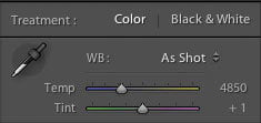
2) In Post-Processing - Eyedropper Tool
This method also involves taking a picture of your gray card in the field, but it's a little bit quicker because you don't have to mess with camera settings. This is a better option when the light is quickly changing or you're on the move.
Again, take a picture of your gray card, ensuring that the same light is falling on both your subject and the card. When taking landscapes I just put the card in the scene, take a picture of it, then remove the card and shoot again.
This is where it's highly recommended to shoot in RAW format. You can use this method if you shoot in JPG but you'll get mushy results because the data is "finalized" in this format, with no room for adjustment.
Import the gray card photo into your processing software. There's usually some kind of color balance eyedropper tool in most programs. I use Adobe Lightroom to correct white balance. The W hotkey selects the White Balance Selector, changing the cursor to the eyedropper. Move the eyedropper to the center of the gray card, click, and voilá, your colors should be corrected. You can then either take note of the color temperature settings and manually adjust the rest of your photos to match, or sync this white balance setting to the rest of your photos. See your software documentation.
In Adobe Photoshop, this is usually done with a Levels adjustment, selecting the gray eyedropper tool.
3) In Post-Processing - Saturation Method
Forgot your gray card? Couldn't get your card in the same light? No worries. There's still ways to save it.
First, look to see if there are any "neutral whites" in your image, such as a piece of paper or someone's white shirt. Use the white balance eyedropper on this area as we did in the previous step and it should get you close.
If you don't have any neutrals in the scene, you can use the following best white balance settings to get you close.
- Tungsten light: 3000K
- Fluorescent light: 4500K
- Midday sunlight: 5000K
- Overcast sky: 7000K
- Shade: 9000K
Then what I do, in Lightroom, is bump up the saturation to 100%. This makes color casts easier to see. I then adjust the color temperature and tint until the colors "look right" and the color casts are removed. I do this in Lightroom because the saturation effects are more subtle and it's easier to see what you're correcting for.
Avoid confusion in Lightroom: The Temperature slider is blue on the cool end and yellow on the warm end, opposite what we just said color temperatures are. When you move this slider to the right, yellow side you're saying "I'm adding yellow because the color temperature is blue," and the opposite for moving it to the left, blue side - you're "adding blue."
Check Your Work
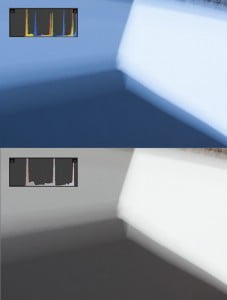
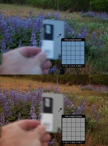
You can use the histogram to see if neutral grays are in fact neutral. Take this cropped-in example of a Cowboy Studio Collapsible Reflector. This is a large, portable calibration panel I use when I need a larger target and/or I don't have to pack light. Also, notice that it's blurry - it was a windy day and I couldn't hold it still, but focus doesn't matter. You can also see that in the image for method #1.
In the top image here you can see that the histogram "spikes" for each color channel are at different locations - the blues are further to the right and this is verified by the image since it looks like it has a blue cast.
But I know that these spikes should correspond to a neutral white, neutral gray, and neutral black. So I adjusted the temperature until all of these spikes matched up.
Again, this is only valid if you have an area in your scene where the red, green, and blue values are equal, as in areas of pure whites through pure blacks, with no color tints.
Final Thoughts
Remember - who says that whites have to be exactly white in your images? I generally make images slightly warmer. That's just my style. Find your style and do what's right for you.
This is especially true for sunrises and sunsets. If we used "proper" white balance in these situations we wouldn't get the dramatic colors that we shoot these scenes for. So bump up the temperature to 5500-6500 for these scenes. Experiment. See which settings give you the colors that you either remember or want.