Disclosure: This post may contain affiliate links. I earn a small commission of product sales to keep this website going.
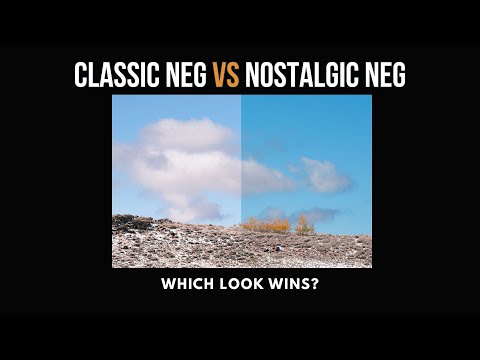
Some time ago, I compared two similarly named Fujifilm film simulations – Classic Chrome and Classic Neg. Today, I’m taking that idea further by breaking down another pair that often gets confused: Classic Neg and Nostalgic Neg. While they may sound alike and look similar at first glance, they produce very different results.
This article covers not just the technical differences – contrast and color shifts – but also the emotional and storytelling differences that can help you decide which one to use.
Watch the video here:
Contrast: The Most Noticeable Difference
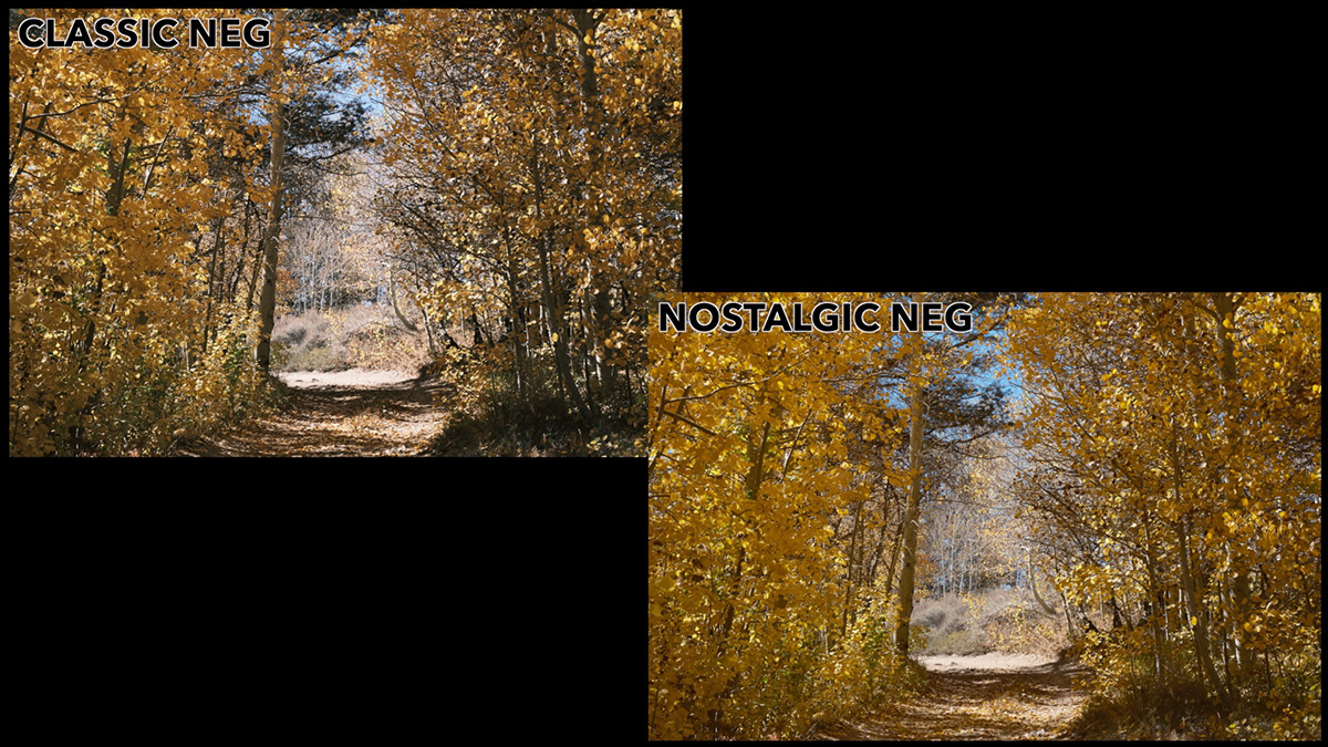
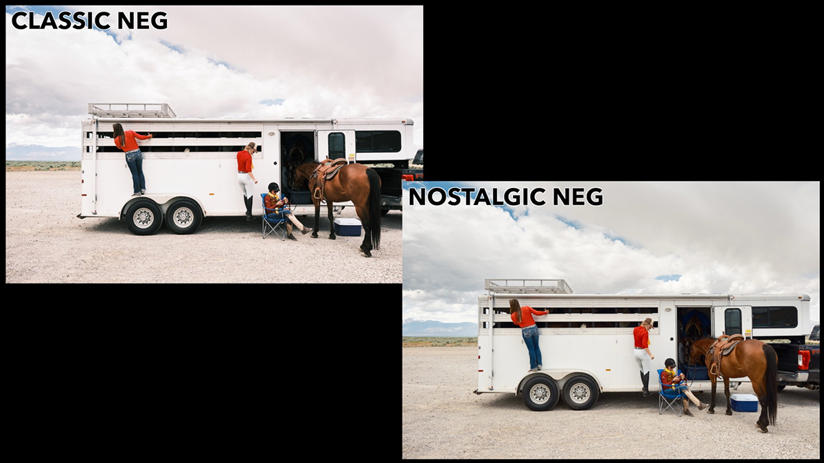
The biggest technical difference between Classic Neg and Nostalgic Neg is in the contrast.
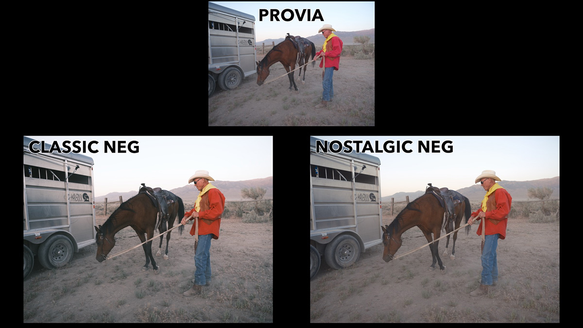
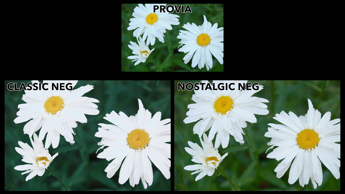
- Classic Neg: High contrast in both highlights and shadows
- Nostalgic Neg: Softer shadows and more forgiving highlights
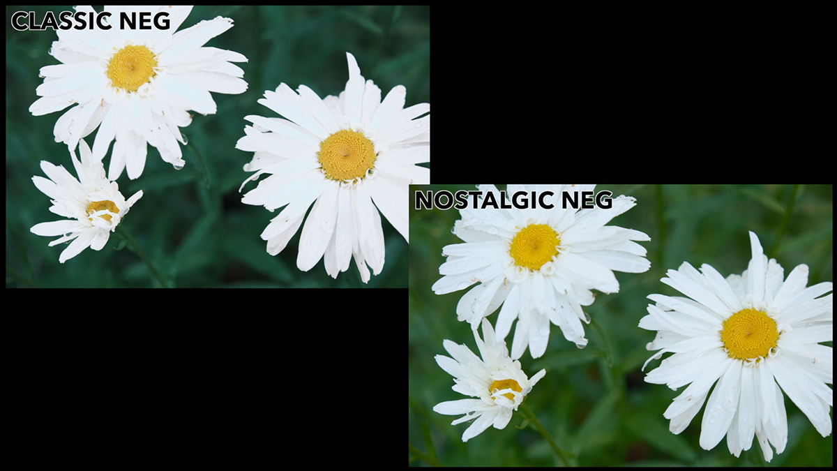
For example, in a side-by-side image of flower petals, Classic Neg clipped the highlights and crushed the shadows. Switching to Nostalgic Neg revealed much more subtlety and texture in both bright and dark areas, with no changes other than the film simulation.
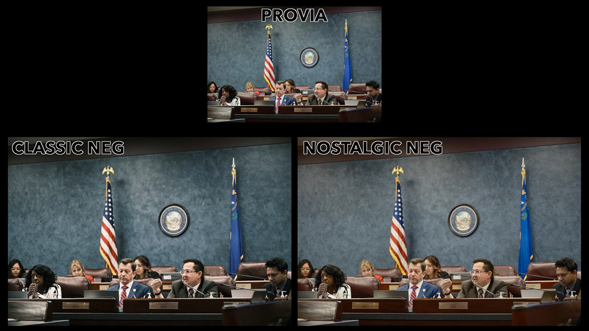
Indoors or in shaded scenes, this contrast difference becomes even more obvious. Classic Neg gives you bold tonal separation, while Nostalgic Neg provides a gentler, more balanced look.
Color Shifts: Subtle but Meaningful
While contrast is the most obvious difference, you’ll also notice color shifts between the two, especially in cooler tones.
In Warm Scenes
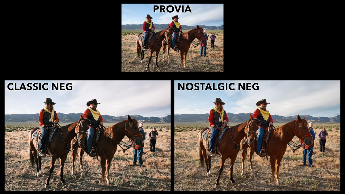
When a scene already contains warm tones – reds, yellows, or golden lighting – both simulations will render similar colors. You may notice some subtle tonal differences, but overall, they preserve the warmth.
In Cooler Scenes
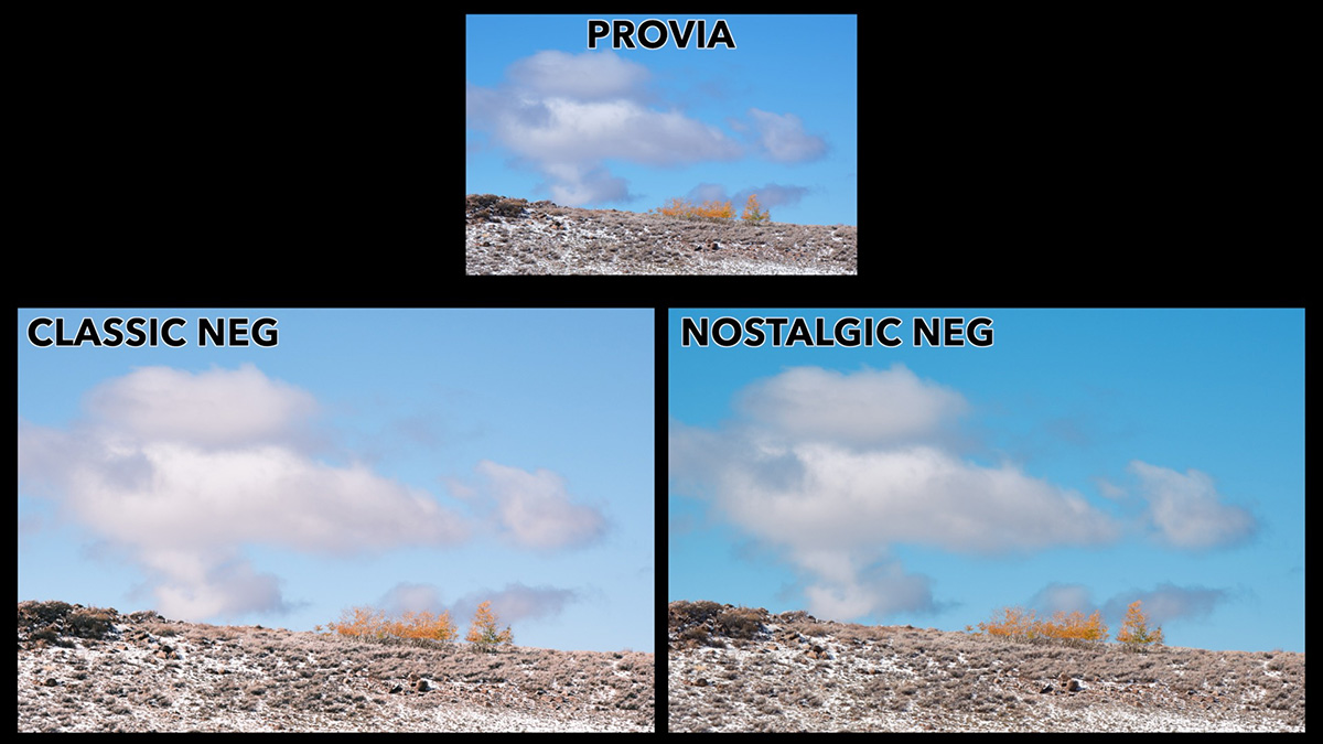
Cooler tones show bigger differences:
- Classic Neg: Shifts greens toward blue and whites toward magenta
- Nostalgic Neg: Shifts greens toward yellow and adds overall warmth
Skies rendered in Classic Neg often show magenta highlights in clouds, while Nostalgic Neg keeps more of the blue, but with a slight yellow warmth. Provia, by comparison, offers a more neutral baseline.
Choosing Based on Feel, Not Just Tech
Understanding the technical differences is important, but in practice, you don’t approach a scene by dissecting the greens or shadow tones. That’s just not how most photographers work.
The real question is: How do you want your photo to feel?
- Use Classic Neg if you want a bold, edgy, high-contrast look
- Use Nostalgic Neg if you want a softer, warmer, more emotional vibe
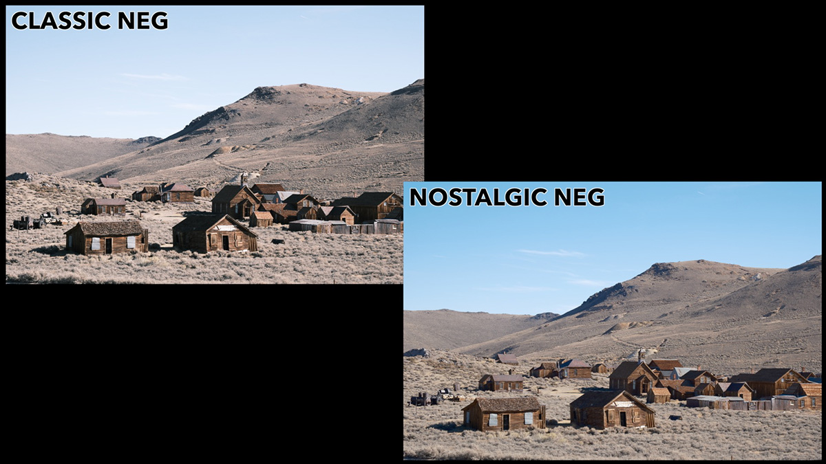
Nostalgic Neg is especially useful if you’re going for a 1970s-inspired look, reminiscent of the New American Color photography movement. It evokes warmth and memory, which is exactly what its name suggests.

Classic Neg vs. Nostalgic Neg: Quick Comparison
| Feature | Classic Neg | Nostalgic Neg |
|---|---|---|
| Contrast | High in shadows and highlights | Soft shadows, less aggressive highlights |
| Greens | Cooler (blue shift) | Warmer (yellow shift) |
| Whites | Magenta tint | Yellow tint |
| Overall Feel | Edgy, punchy, cinematic | Warm, nostalgic, soft |
| Best For | Street, urban, high-drama scenes | Portraits, lifestyle, retro vibes |
See All the Fujifilm Film Simulations Side-by-Side
If you’d like to explore more Fujifilm film simulations and how they compare across a variety of scenes, check out my FREE course: Learn Fujifilm Film Simulations.
Have questions or your own preferences when using these simulations? Leave a comment below, I’d love to hear your take.
Keith Brewster
Saturday 18th of October 2025
Thanks for this, it was very helpful. Comparing recipes in both quantitative and qualitative terms was particularly interesting. Whilst it's always "horses for courses" I did find the nostaligic neg example images consistently more 'appealing' than the classic neg ones. And your discussion of the differences helped me to understand why. Regards, Keith.
John Peltier
Sunday 19th of October 2025
Oh that's great to hear, thanks. It's easiest to use these if you just find a few that are most appealing to you and use those, rather than trying to understand them all, and I'm glad this helped.